
Your Readiness Score will give you a summary of your current load monitoring status and if your risk of injury is increasing or not.
Within Readiness, you will see the load monitoring graph shown below.
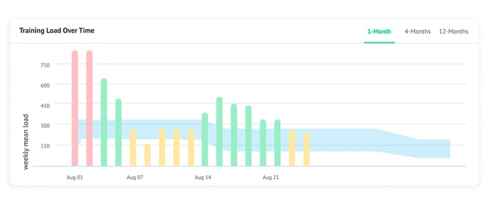
How to Read this Graph
Each bar represents your daily training load (all workouts on the same day are combined to generate your daily load).
The blue blob is called a "river plot," and shows your load sweet spot or safe zone. This area is where the daily load needs to be to stay between the target of 80 - 130% of the average over the past 28 days.
- Any day where your 7-day average stays between 80-130% of your 28-day average. the bar will be green and land in the blue river plot
- Any day where your 7-day average load falls below 80% or between 130 - 200% of your 28-day average, that day's bar will turn yellow and be either above (130-200%) or below (<80%) the blue river plot
- A red bar above the river plot happens when the 7-day average load exceeds 200% of the 28-day average. You shouldn't see any red bars below the river plot.
How to use the graph
The bars tell you about your past performance and how safely you have been training, while the river section shows how much load you can safely withstand.
This area represents the target training load range for each athlete. Bear in mind, each individual's river plot will differ in size and widen or broaden depending on load averages over the past 28 days. When overall load is larger, the river will be wider as the variance between the Safe Zone's top and bottom will also be larger.
This graph should be used with your Readiness Recommendations to help shape your training plan over the next several days.