
Activity Details provide you with the opportunity to explore the metrics generated during a Live Workout, broken down by Set, Rep, and Lap. With so much data to analyze, it can feel overwhelming. That’s where your Triton Score, particularly your Focus scores, comes into play, helping you easily interpret this information. However, if you're a data nerd like us, this is the perfect time for you to dive deeper into the details.
Manually entered workouts will not have a details page. They only have the information entered when creating it, which is viewable on the summary page.
Activity details on a phone
Skip to: How to do this on a tablet
Click on the blue arrow ![]() from any Activity Card or
from any Activity Card or ![]() a Team Activity Card in your Feed to dive in. Once here, you will have the choice to view the summary or dive deeper into the details with the tabs across the top.
a Team Activity Card in your Feed to dive in. Once here, you will have the choice to view the summary or dive deeper into the details with the tabs across the top.


Once you have selected Details, you can view the results for 6 metrics at a time for each set, rep, and lap and plot them on rep and lap graphs.
Switching between Sets, Reps and Laps
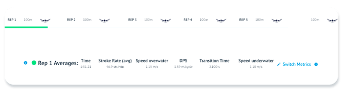
Tap the set you would like to view from the set list across the top, and the set in the list will turn blue. Your 6 metrics will display the set-level averages with a blue dot to denote set-level data, and the reps from the set will be the points on the rep (top) graph. 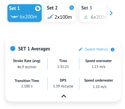
Scroll down to the list of reps between the two graphs and tap a rep to select it. The selected rep will now have a blue line below it. Your six metrics just below the set list will change to rep-level data, denoted by a green dot, and the laps from this rep are plotted on the lap (bottom) graph. 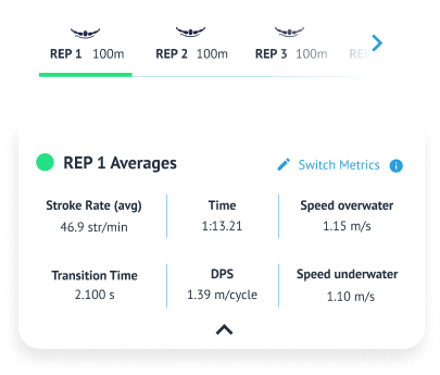
To view lap-level data, tap on a specific lap in the graph, indicated by a red dot. Tapping on the lap again will de-select it and revert to rep-level data.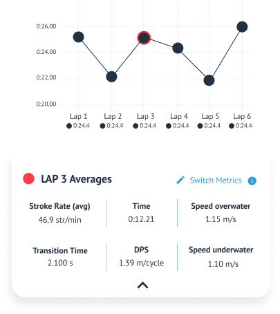
Switching the graphed metrics
In the Rep and Lap graphs, time is shown by default. You can easily switch what metric the graph is showing and select any of the six default metrics. You also have the option to add a second metric to compare against or go back to just one metric whenever you want.
When you have a single metric displayed, you’ll see it above your rep graph.

- To add a second metric, just tap the plus symbol.
- Then, use the drop-down menu to choose any of your six metrics to display on the graphs.

If you’ve added a second metric, you’ll see both metrics on the graph.
- You can use the drop-downs to switch between any two of your six metrics.
- Scroll to the bottom of the page to find the legend, which shows which metric is represented by the solid line and which one is the dotted line.
- To remove the second metric, simply tap the X icon.
Activity details on your tablet
Return to: How to do this on a phone
Click on the blue arrow ![]() from any Activity Card or
from any Activity Card or ![]() Team Activity Card in your Feed to dive in. Once here, you will have the choice to view the summary or dive deeper into the details with the tabs across the top.
Team Activity Card in your Feed to dive in. Once here, you will have the choice to view the summary or dive deeper into the details with the tabs across the top.

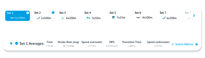
Once you have selected Details, you can view the results for 6 metrics at a time for each set, rep, and lap, plotting them on rep and lap graphs.
Switching between Sets, Reps and Laps
Tap the set you would like to view from the set list across the top, and the set in the list will turn blue. Your 6 metrics will display the set-level averages with a blue dot to denote set-level data, and the reps from the set will be the points on the rep (top) graph.
Scroll down to the list of reps between the two graphs and tap a rep to select it. The selected rep will now have a blue line below it. Your six metrics just below the set list will change to rep-level data, denoted by a green dot, and the laps from this rep are plotted on the lap (bottom) graph.
Finally, tap on a specific lap in the graph to change your 6 metrics to lap-level data, denoted by a red dot. Tap on the lap again to de-select it and return to rep-level data. 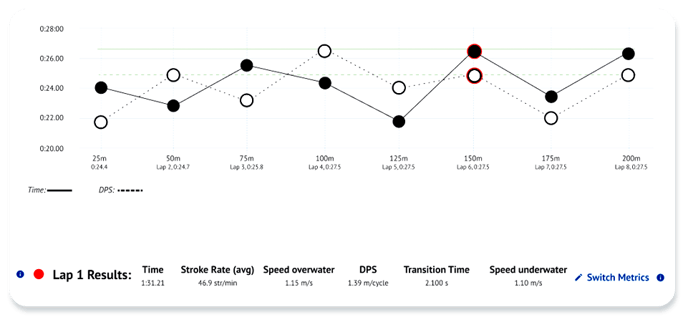
Switching the graphed metrics
In the Rep and Lap graphs, time is shown by default. You can easily switch what metric the graph is showing and select any of the six default metrics. You also have the option to add a second metric to compare against or go back to just one metric whenever you want.When you have a single metric displayed, you’ll see it above your rep graph.
- To add a second metric, just tap the plus symbol.
- Then, use the drop-down menu to choose any of your six metrics to display on the graphs.
If you’ve added a second metric, you’ll see both metrics on the graph.
- You can use the drop-downs to switch between any two of your six metrics.
- Scroll to the bottom of the page to find the legend, which shows which metric is represented by the solid line and which one is the dotted line.
- To remove the second metric, simply tap the X icon.
Enabling My Average and Like Me lines
The final element you can plot on the graph is the "Like Me" or "My Average" lines from the Focus metrics. This feature only applies to Focus metrics and is limited to laps, reps, and sets that utilize the same stroke type. The reasoning is straightforward: comparing a line for Fly against Freestyle data is not useful.
To enable these lines, select a Focus metric (such as DPS), then check the box for either "My Average" or "Like Me," which will appear above the rep graph. Just so you know, you can only enable one option at a time.
Make sure the dropdown next to your chosen line is set to the appropriate stroke type so that the lines represent comparable data.
If you have 2 Focus metrics plotted, you will get a Focus line for both metrics, and the dotted vs solid line will match the selected metrics.
Use this to compare your performance in this workout with that of your like-me comparison group (cohort) or to see how closely you followed your typical skill execution lap by lap or rep by rep for the chosen workout.
